UA Neo Fonts
The UA Neo fonts were the first revival of Unified Arabic type introduced by Nasri Khattar in the 1950s....

Calligraphy and typography are considered as one of the most important art forms in the Islamic and Arab world. It is an important element in decorating objects and buildings. One of its most notable uses is in the Islamic holy book. Many scripts emerged from religious, political and cultural functions. This timeline goes over some of the most prominent scripts from the first known Arabic alphabet script, Al-Jazm, to Modern Calligraphy.

Before the 6th century
Jazm
Al-Jazm is the first script that resembles the Arabic alphabet. It was mostly used by the Northern tripes in the Arabian Peninsula. This script would continue to develop until the early Islamic era in Mecca. This script was used in the earliest written Islamic holy book, the Quran. The main features of the script are the stiff, angular, and well-proportioned letters.
7th century
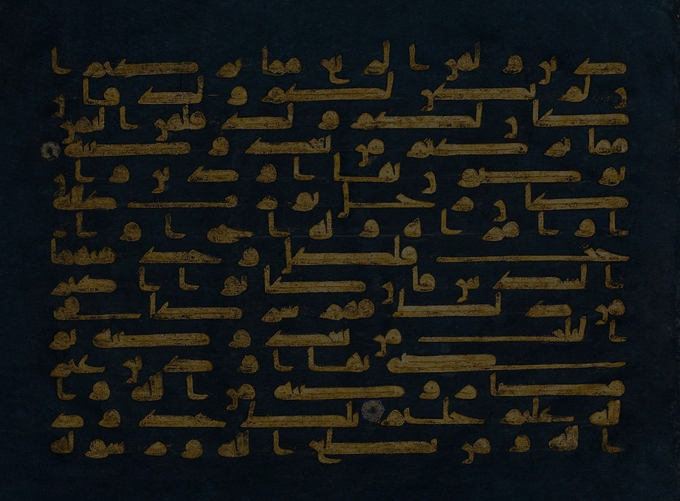
Kufic
The Kufic script evolved from the Al-Jazm script. It developed from the alphabets used in the city of Kufa in Iraq, from which its name is derived. It was most notably known as being the preferred script for the Quran and used in architectural decorations. The main features of the script are it's angular, rectilinear letterforms and it's horizontal orientation.

10th century
Naskh
Naskh in Arabic means ‘to copy’. It is categorized as being a smaller and rounder script of Islamic calligraphy. Because of their easy legibility, round scripts became popularized around the 11th century and used for writing administrative documents and for transcribing books. Although the Kufic script is commonly believed to predate the Naskh script, historians have found some evidence that the two scripts coexisted at some point. Kufic was primarily used for decoration while Naskh was used by scribes.

11th century
Thuluth
Thuluth means ‘one third’ in Arabic. The script is written on the principle that one-third of each letter slopes. It's is characterized as being a large and elegant cursive script. Similar to the Kufic script, it is used to write larger text like headings and used as decoration. The Thuluth script replaces the angular lines used in the Kufic script by curved and oblique lines.

18th century
Riq'a
Riq’a is derived from the Arabic noun, ruq’a , meaning “a patch or piece of cloth.” The script is the most commonly used type of handwriting in Arabic. Unlike many other typography styles, Riq’a is not considered an art form and it was made to be functional. The script is known for its letters composed of short, straight lines and simple curves. It was widely used in the Ottoman Empire.
20th century - now
Modern

UA Neo Fonts
The UA Neo fonts were the first revival of Unified Arabic type introduced by Nasri Khattar in the 1950s. In the early 2000s his daughter, Camille, was entrusted to revive her father's font to make them aline to his vision and design approach.
Nasri wanted each letter to be created with only one single glyph shape. Camille played with his initial design and found some letters that could be confused and misread as other letters. This led her to draw new shapes for those letters that included two glyphs instead of one.
This type was originally created to solve the problems of typesetting and printing that was prevalent during the early and mid-1900s. Arabic has always had these problems. That is why, until recently, Arabic manuscripts were hard to reproduce. To be reproduced it had to be handwritten. But now with modern digital technology that problem doesn't occur anymore.
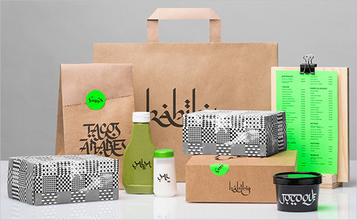
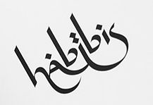
Habibis Identity Desgin
Habibis is an Arab-Mexican taco shop located in San Pedro Garza García, Mexico, a city enriched by culinary arts of its third generation Arab immigrants. The restaurant’s brand identity mixes the Arab and Mexican background of its food and culture without losing its street-friendly casual demeanor.
What interesting about the typography is the way it mixes Arabic and Latin type characteristics. The brand uses the Latin alphabet but gives the letters fluid and Elongated elements. It also adds the diamond-shaped dots that are sometimes parts of the letter, like in the lowercase ‘I’ and other time are just decorative, like on the ‘A’.
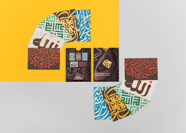
Inspiral Design's Calligraphic postcards
These set of postcards were made by Soraya Syed for the Museum of Islamic Art in Qatar. Each card uses a different style of script, square Kufic, Thuluth, Maghribi, and Diwani script, two of which I have gone over. The green cards uses a variation of the Kufic script called square Kufic and the black and red one uses the Thuluth script.
These postcards designs are unique because of the use of type as decorative elements. Although a number of the type I previously talked about are used as decorative elements, these cards push that to another level. In the past decorative type that was used was still mostly legible. These calligraphy set of postcards uses type as purely a decorative element. It crops letters and words out and uses type to form shapes and negative space rather than to say something.